
Beauty Clinic
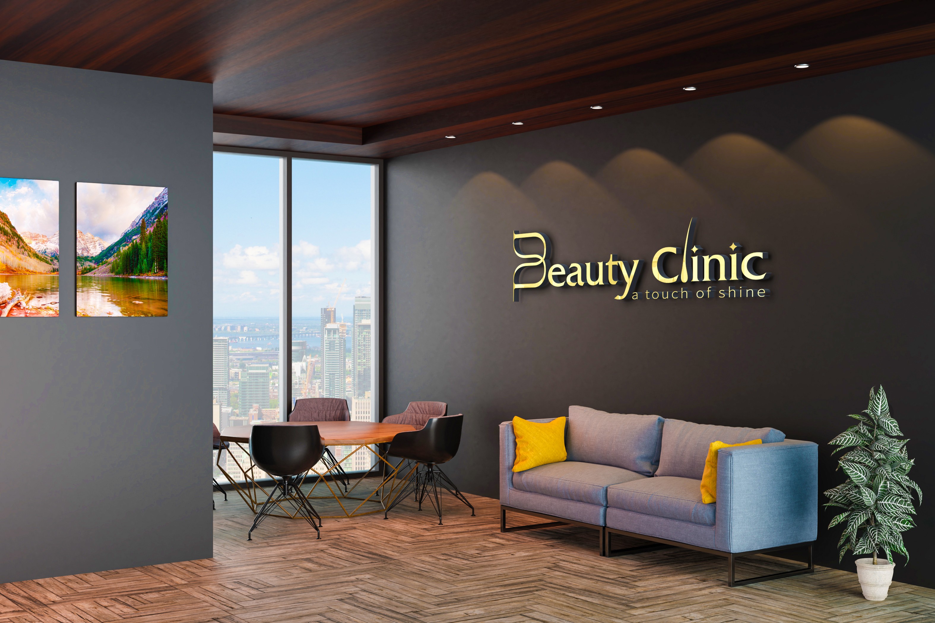
The logo combines elegance, softness, and beauty through its subtle details. The L is designed to resemble a flowing strand of hair, reflecting the clinic’s laser and hair-removal services, while the B takes the form of a delicate flower petal, symbolizing the softness, beauty, and gentle care the clinic brings to every client.
Client
Sonsos Kabha
Category
Logo Design
Live



Other Projects





Let’s work together
Drop me a message or reach out directly — I’ll get back within a day.